This is very important tutorial for those who wanted to make their First ever website project. In this tutorial I’ll teach you how you can make your First ever Interface (Mockup) for your project. You will also learn some basic things to keep in mind before starting the project. So lets start Design an Interface in Photoshop Tutorial.
Note:
As we are making a proper interface and it is having large size so it will not fit here, so I’m going to reduce the size of every file to fit here. If you want to see the final large image then click on the bottom image to see actual large view.
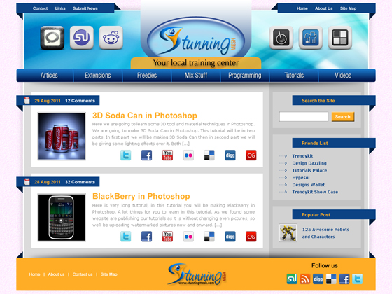
This is the Final Result of Design and Interface in Photoshop Tutorial:
1. First of all we have to see that for which Screen Resolution we are going to make the Interface? Mostly interfaces are being made for 1280 x 1024 resolution. So you have to give some extra space for Vertical Scroll bar for all browsers. Height should not be a matter but width should be. I mean to say Horizontal Scroll bar for any project looks Odd. So we are going to make an interface for 1280 x 1024 resolution. Let us take a new file in Photoshop having width 1200 px and height 800 px. I’m intentionally taking smaller height file, so that I’ll let you know how you can increase the height after making some part of interface. So lets start our Design an Interface in Photoshop tutorial, for this purpose take the new file in Photoshop, having the following size:
2. Now I’ll be using a background image for whole website, that background will be out of Website area, so our website would be within the width of 1100. So I’m going to leave 50px area from left and 50 px area from right. I’m going to insert Guide lines, pick Rectangular Marquee Selection tool and draw a rectangle of any site starting from the extreme left of the file and then press Shift+Right Arrow key 5 times, so our selection would be move towards right 50 px, then pick Move Tool
and if Ruler is on then take Vertical Guideline from Vertical Ruler (if Ruler is off the press Ctrl+R to switch it on). So I’ve put 2 guide lines as:
3. Now pick Rectangle Tool and draw a rectangle having width 1060 px and leaving 30 px from top, draw the rectangle in the middle of the file and fill it with #dbdbdb color as shown below:
4. Give the following Layer Styles over it (by running the command Layer >> Layer Style >> Drop Shadow, Inner Shadow, Stroke) and give the following settings:
after hitting OK, you will get this effect:
5. Now I’ve planned to separate this area into 3 parts, i.e. Top Header, Middle body Area and Bottom Footer area. For our convenient, we should work in Groups, from layer panel. I’m going to take a new Group and renamed as “Header” like:
So we will be making every object for Header into this group.
6. Now I’m planing to use my log in the middle of Header, so I’m going to make some container to put my logo inside it. Pick Ellipse Tool and draw and ellipse of sie 340 px width and 190 px height and put in the center and top of our gray background as:
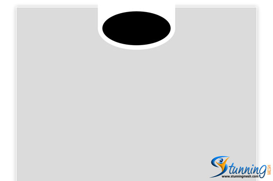
7. Draw another ellipse but this time having the size 300 px width and 150 px height and put it in the middle of white ellipse as:
8. Select white ellipse and goto Layer Panel, right click over its name and select Rasterize Layer, now pick Rectangular Marquee Selection tool and select the upper half part of the ellipse and hit delete key. Keep marquee selection on, hit down arrow key once, then pick Move Tool
and hit up arrow and down arrow once so that 1 pix part would be separate from the ellipse, zoom in to the top area and press Ctrl+T and then change the height towards top, so that you should have something like this:
9. Now select Black ellipse and open Styles Panel (by running the command Windows >> Styles) and apply any style you like over Ellipse, I’ve chosen the following:
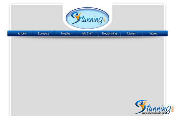
10. Place your logo over it:
11. I’m now going to make the Menu Bar, just below the logo. For my convenience I’m going to make the group for Menu Bar, so it will be easy for me to move it, if requires. So pick Rounded Rectangle tool and draw a rectangle of size 1100 px width and 40px height, with 5 px rounded corners as:
12. Apply the gradient having #001448 and #1a78ca from bottom to top, so that you may have menu bar as:
13. Now I’m going to make 7 parts of the menu bar, because I need 7 items in the menu bar. As 1100 will not be having 7 equal parts, so I’m going to leave 25px from left and 25px from right, so that we may have 1050px area and will be having 150px area for each item. I’m going to put divider in between these items. To make divider, take new layer and draw a selection of 1px width and 40px height and fill it with #000b27 color, then move the selection towards right 1 px and fill it with #1d96ff color, so that you may have this:
Copy this divider 5 more times and place it towards right have 150px gap in between, so that you may have:
14. Put your desire Item text over it, I’ve put the following items, and given 1 px drop shadow (font will depend upon the nature of project).
15. Pick Ellipse tool and draw a long thin ellipse of size 1000px width and 50px height. Run the command Filter >> Blur >> Gaussian Blur and give 10 px and hit OK, then remove the top part of the ellipse and place it just under the navigation bar as:
16. For logo base line I’ve placed a Rounded Rectangle just under the logo and above the menu bar, fill it with #ffad26 color and reduce the opacity of the layer to 85%, put your text over it and you should have this:
17. Now to make header a bit attractive, I’ve placed a dynamic background over it as shown below:
18. I’m going to make 2 areas for top left and right links. First I’ve taken a Group in layer panel and then after taking new layer make a rectangle of size 300px width and 30 px height and fill it with #0c4385 color. As shown below:
19. Make 2 triangle having the color #001b3b and write your Menu items in it as shown below:
Copy this group and Flip Horizontally move it towards right side as:
10. Now I’ve placed some Social Bookmarking site’s logos on header as:
11. Our header is almost ready, we will give some final touching at the end. So now we are going to make the Body part, I’m going to take another group for it. So after taking the new group, create new layer and make a rectangle having the width 290px and color #c3c3c3 towards the right side of the body area as:
12. If you are working on a Quality project, then you have to keep everything in mind. You also have to keep in mind even 1 px. Because when you have to slice it in CSS, that 1 px may disturb you. So we will also keep gaps, distances between objects in mind. So now I’m going to make some different things towards the right area, but I’ll be making only one area, then copy it by some modifications. So now I’m going to make first area towards right side. First of all take a new Group and then take Rectangle Tool and draw a rectangle having the color #d2d2d2 width 270px and height 110px, but in the center horizontally of the gray bar, and exactly 30 px down from to navigation bar as shown below:
13. Now I’m going to copy the top left and right menu bar background and corner shapes for this, so select blue strip and small rectangles one by one and press Ctrl+J to copy them and move their layers into this Group, where you are going to make this area, I’ve reduced the width of blue strip, have a look below:
14. I’ve now write the text “Search the site” in #ffad26 color and in Arial font with 14pt size. Also I’ve made a white rectangle of size 150px width and 30px height. Remember to place it by having 20px from left and bottom and apply the following Layer Style on white rectangle:
so you may have this:
15. Pick Rectangle tool again and draw a small rectangle of size 70px and 30px and color #ffad26, towards the 10px right side of this white box and apply the following layer styles over it:
then write the word “Search” over it in White font with Arial font and 12pt size, you may have this:
16. As we have made all these things in one Group, so goto layer panel and right click over this Group and select Duplicate Group, give it name “Friends List” and move it towards down, giving 20px gap in between, change the title of this box from “Search the Site” to “Friends List” and delete the white box and Search button and change the background size (I’ve given 270px width and 200 px height), as:
17. Now I need to enlarge the canvas size but I need extra canvas towards the bottom of the file. So run the command Image >> Canvas Size and give the following settings:
after hitting Ok you may have this:
18. Now enlarge the size of gray background but it should be above 20px from the bottom of the file, also change the dark right gray area, you may have this:
19. I’ve copied “Friends List” and renamed it as “Popular Post” and made the following area:
20. Now I’m going to copy these areas to make Body Areas Posts, I’ve copied different areas and added a picture in it, no new step used, all work done by using the previous steps, so you may have one post as:
21. I’ve copied this post and given it name as Second post, change the picture and details as:
22. So our Body area also complete, now I’m going to make the Footer area, as usual first of all I’m going to take the Group from layer panel and will be making everything for footer inside it. I’m also going to copy some already made parts into it, like Menu bar’s bottom shadow, blue triangle, like:
23. So finally I’ve put some Social Bookmarking links and navigation links over the footer and made this Design an Interface in Photoshop:
24. I’ve given some pattern in the background of interface, then given some final touching over it and get this final Interface, hope you have learn some points by following this tutorial. Enjoying making your own now, we just finalize our Design an Interface in Photoshop Tutorial, click the Image to get large view:
How to Slice an Interface?
After completing the Design an Interface in Photoshop tutorial, now you need to convert it into Website, to launch on the NET. You should visit our following Tutorial (in 3 Parts) to convert this interface into Website (using Slice and Dice Technique)
https://www.stunningmesh.com/2010/07/slice-your-mock-up-to-make-website-part-i/
https://www.stunningmesh.com/2010/07/slice-your-mock-up-to-make-website-part-ii/
https://www.stunningmesh.com/2010/08/slice-your-mock-up-to-make-website-%e2%80%93-part-iii/


Hi, Thanks for the tutorial!
I’m a new in photoshop world and try to learn. You can share the files to download please?
Thank you in advance.
cool!!!but i don’t hunderstand how to work with this cool web site.how to make this work interactive….. after the intarface …. !!!! cool
If you want to convert this interface into Website by using Slice and Dice technique, then visit our following tutorial in 3 parts:
https://www.stunningmesh.com/2010/07/slice-your-mock-up-to-make-website-part-i/
https://www.stunningmesh.com/2010/07/slice-your-mock-up-to-make-website-part-ii/
https://www.stunningmesh.com/2010/08/slice-your-mock-up-to-make-website-%e2%80%93-part-iii/
WoW it’s awesome. Thanks to share