You may have a shop, a parlor or a limo service. Whatever it is; you would want it to be fastidious and well-organized. The reason: you know that the appearance of your business matters. You know that clients judge things by their appearance. And you know that you’ve got to keep it attractive to sell it. This holds absolutely true for every business in Nottingham. Do you then think that websites are any different? Sure, you don’t and if you do, you are terribly mistaken. But, this article is not to inform the readers on the essentially of having a good looking website and to explain some points to design an appealing interface. It is only addressed to the converted who understand the consumer psychology; and it is meant to give them tips on how they could have a stunningly attractive interface for their website so that the visitor feels at home and does what you want; be your privileged client!
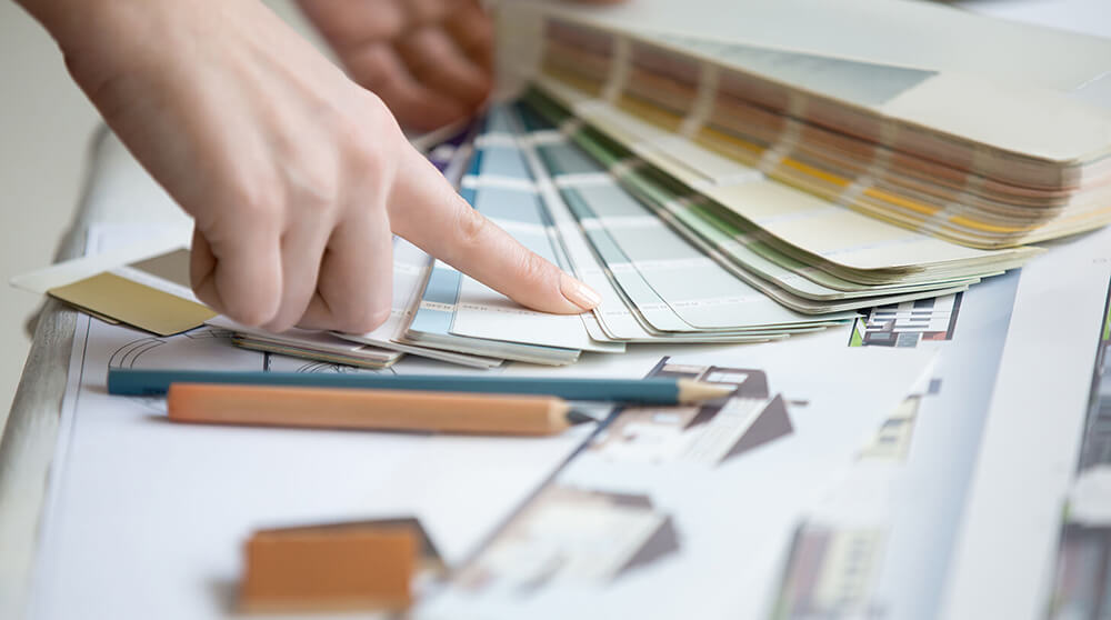
The Color Scheme of Your Website:
Colors have the deepest effect on human psychology. Why do women like red? Why do lawyers wear only black gowns? Why does one need to just give three colors-red, blue and white-to mean Pepsi, why not the full logo? All these are just few examples of how consumers’ chemistry accepts colors as the prime means of assessing a brand. If you are to choose a color scheme for your website interface, you may be in a lot of dither. Let’s figure out the appropriate answer for your case.
Try to go for bright colors like Orange, Green and Blue. Most successful websites like Amazon, EBay and Google use this color scheme. The reason: it gives a sense of freshness. However, this color scheme may not be suitable for all websites. For example, if your website is about a construction firm or heavy equipment, you should prefer solid colors like maroon and grey. In short, bright colors are for websites that required impulsive action by the visitor, like buying a product or getting a membership.
The Pictures:
Pictures give your website a new life. Everyone ranging from elite business schools to websites selling products have it. You should know that pictures give credibility to your words. These subtly convey to the reader the real-life application of what is being said. It also introduces an element of integrity into your business. Human mind is more susceptible to being influenced by a combination of pictures and words than by words alone. However, you should choose your pictures carefully.
If you run a website that is meant to encourage people to consider your website as a long-term part of their life, it’s better to use animations. These look fresh and there is no risk of anyone getting repulsed just because he thinks that the person in the photograph could have done better. Elite business schools, investment-offering companies and NGO’s use such animations. However, if you are having a website that offers the consumers to have a one-time or short-term contract with you, e.g. buying something from you, hiring car from you, it is better to have photographs showing real people. The ability of the real-life photographs to galvanize people into action is used as a great tactic even by scam companies. The bottom line: pictures have an effect and you should have them. Try showing buildings like Nottingham City Center to create a sense of intimacy between the visitor and your website!
Mike studies cognitive functions of human minds in respect of computer-driven innovations. He also draws sketches to suit Web Design Nottingham of Nottingham Culture.
