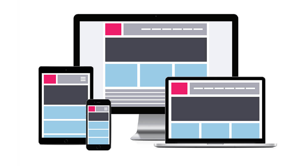
Just a few years ago the standard in web design required a developer to create a blogging site or website to display properly when utilizing various operating systems on laptops and desktops. That is no longer the case. Because of the increasing accessibility of mobile devices, including smart phones, coupled with the evolving mobile technologies, many people now reach for their phones to connect to the Internet. As a result, web designers now need to incorporate responsive web design in their coding.
Without creative responsive mobile designs, the end-user can quickly become frustrated from their Internet experience when viewing a website developed for a desktop on their small smart phone screen or mobile device. After investing heavily in online marketing strategies and Search Engine Optimization (SEO), companies can instantly lose a potential customer to a frustrating experience.
As a result of this challenge, WordPress, the world’s most highly recognized CMS (content management system), offers a huge array of mobile-friendly solutions. In addition, some third-party companies have developed professional style WordPress themes that incorporate responsive technology as a quick solution to this growing challenge.
What Is Responsive Mobile Design?
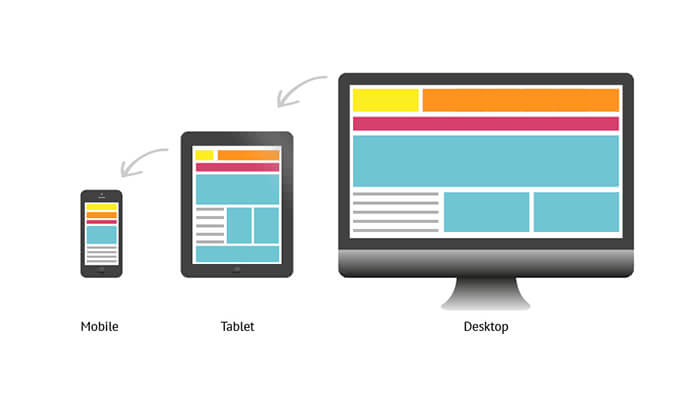
Responsive mobile design is a set of complex computer programming coding designed to quickly generate a simpler version of a company’s website. Whenever a visitor lands on the company site using a tablet, smart phone or other mobile device, the automatic response of the website’s mobile design will quickly strip away any unnecessary function and/or asset. This will immediately reduce the web page load time while still displaying essential pertinent information.
Utilizing a responsive website WordPress theme avoids the necessity of developing and maintaining multiple sets of content and/or multiple websites. It is built on a responsive CSS framework that can quickly create responsive layouts on a growing number of Internet enabled devices and gadgets including smart phones and tablets.
Displaying the Content Correctly:
As the company’s webpage begins loading on the visitor’s device, the responsive CSS framework will automatically adjust the layout to quickly accommodate the user’s fixed or mobile device. The adjustment will be reconfigured from the various sizes and orientation screens available. The quality of the WordPress theme (template) coding will determine the quality of the display results. High-quality responsive WordPress templates will allow companies to avoid the creation of a standalone mobile website, which duplicates company content. In the end, this will save both money and time.
No Programming Necessary:
One of the most significant advantages of utilizing a high quality WordPress theme built with responsive CMS framework technology is that it is simple and easy to use. It can quickly reconfigure any type of website including online stores, businesses, portfolios, blogging sites, educational sites and more. Any amateur, or advanced designer, can quickly reconfigure the site without the need to program the code. Some responsive WordPress templates are retina-ready to accommodate the next generation of Apple tablets, along with iPhone, iPad and iTouch.
Satisfying the Visitor:
Online visitors viewing a company site expect a full website experience regardless of the type of device they are using. However, there are specific limitations to looking at a website on a smaller screen. As a result, responsive design has proven to be the best cost-effective choice for maintaining a business site. In the end, it can easily diminish content maintenance requirements while reducing costs and future upgrades.
Most SEO (search engine optimization) experts recognize that sites constructed with responsive design technology are proving to be far more SEO-friendly. This is because they do not pass along unnecessary links from other domains as is usually found in mobile specific website designs.
Faster Speed:
There are significant advantages for both the company and the viewer including a faster download, and more distinct content. Any mobile user looking at the company website constructed with a responsive design will automatically have the information resized to fit the mobile device screen. By stripping away HTML code and JavaScript, the screen can quickly reconfigure. Additionally, full-size websites displaying their responsive web design have unnecessary content stripped away, providing more distinct content to the viewer. In a world where mobile users want fast and direct answers, distinct content is exactly what the visitor needs.
Continuity:
One of the benefits of operating a single URL, or dedicated website, is the continuity a single site provides its viewers. Without the need to share content or data with a separate mobile site, ensures every online user their receiving a consistent level of data and service no matter how they choose to connect to the website – on a mobile device or stationary desktop. Online marketing specialists have long recognized the importance of providing continuity on e-commerce sites.
Constructed as a flexible foundation utilizing a fluid grid system, these highly developed responsive website platforms can quickly convert a desktop configuration to a mobile device. Using intelligent framework technology, a responsive web design provides the best solution for any company with an online site.