Every web designer should be able to learn how to interpret the tricky color terms used in web designing. This is important in order to make them more knowledgeable when they are engaged in the color designing schemes involved in web or graphic designs. Understanding the proper color terms applicable in web designing or graphic designs is an important consideration if you want to build a pleasing and appealing website to your potential online visitors. Newbie learners in web designing are often lost and confused with the tricky terms used in color schemes when designing a website and it helps to understand more about these basic terms to the more complex ones as a good foundation when you embark on color designing for a website with the ability to interpret them more appropriately. This will help you understand better the common jargon used in different color terms.
Hue:
This is the most basic term used for colors in the web or graphic design. Hue defines the color of an object. It is an important color used in order to convey a message to your web visitors. Each color depicts a different meaning and combining the colors that you will use for your graphic can be fun and artistic. When you refer to specific color terms like blue, red, orange and yellow, you are already talking about hues.
Chroma:
This is a term that refers to the purity of color. When a color or hue has a high chroma the color is pure without any blend of black, gray or white in it. Adding any of these three colors to a single color will reduce its chroma. When designing your web pages it is recommended not to use colors with the same chroma but use ones with at least a few different range of chroma instead in order to create a more sophisticated and elegant color combination for your graphic or web design.
Gradient:
This refers fading from one color to another color. This will involve greater customization of your color patterns in order to bring a more metallic look on your design and to improve the color depth of an object. Gradients may take various shapes such as round where the color fades from the center going outwards.
Ambient light:
This is the light that compensates for the color surrounding’s level of brightness or lighting. There is a light measurement that a graphic designer can use in order to adjust the background color. But a common practice is using light grey walls with a constant lighting in the background.
Saturation:
This refers to how a specific color will appear under a certain lighting condition. One may refer to a color saturation as weak, pale or strong. Graphic designer use saturation in order to create a more cohesive looking design that will result in the unity of colors in a graphic design. You can create a watercolor effect when you combine colors colors that are created on the same muted saturation, making the color effects in a softer design of your objects.
Additive Colors:
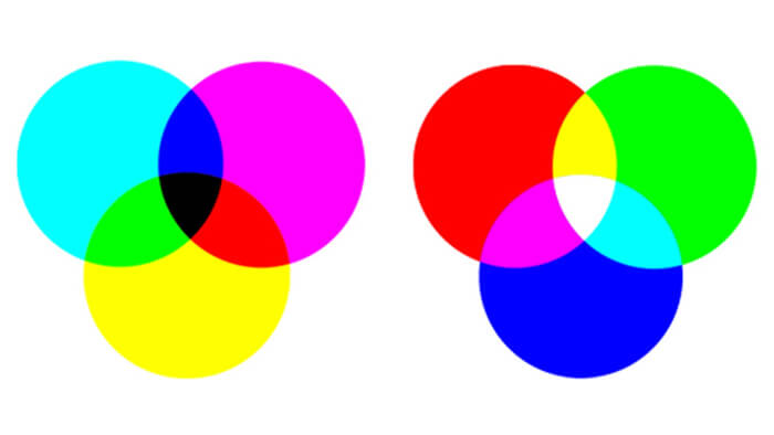
These are colors that are produced when a light falls on a surface. This refers to the specific colors of blue, red and green. When you add these colors together you can produce a white light sensation on your objects.
Soft Proof:
This is used to check the colors used for PDF or printouts on-screen without the need to actually print the color to view them. Soft proofing allows you to check for the color workflow on your design by preview without necessarily printing them.


