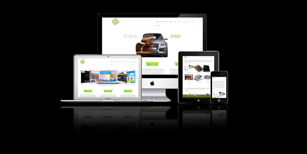
Responsive Website Design, the most powerful and best Technique to make your website automatically fit according to the Browsers or Devices. It is used to make Reading and Navigation so easy and to minimize the resizing, panning or scrolling. Here are 5 Best Responsive Website Design Examples of 2013.
Canvas:
a website where you can buy posters online and see how they are on the walls of the house
In circulation there it is a well-designed site for all tastes , styles , sizes and budgets. Design enthusiasts (but not only ) operate more or less often in search of the posters that give greater emphasis to the disciplines of graphic design and illustration, but how can you understand more easily if it is actually suitable for the walls of our homes?
Canvas comes to answer this question – it is a website almost completely made in Flash, which with a very intuitive interface and a navigation system that simulates 3D, allows us to do a series of online tests to assess the performance of a poster in a certain room in the house. There is also a good choice of alternatives to buy. It can also be described as a ‘ play ‘ fun that can reserves a few minutes to feel a bit the magic touch of the designers.
The Taste in Web Design Geokeske:
Geokeske is a restaurant in El Paso (Texas) that thanks to the work of Viva Creative Group and Impulse has relaunched its image with an “appetizing “website full of high resolution photos and animation almost imperceptibly thanks to jQuery.
It has a targeted use of JavaScript web design combined with a refined and elegant typography in the department also makes this site unique and worthy of admiration. The slight fade with each page load, even if it makes little inevitable because of the slowness of the photo in the background , the typography of the titles, the slight animation of the logo on the homepage make it a sure source of inspiration. The defects? The menus can be downloaded in pdf without the possibility of online browse (unforgivable for a web designer) .
New website of Phaidon, exclusive interview with the director of the London Design Festival , Ben Evans:
In a sense, this recent restyling, respects the original intent: the Phaidon was in fact born in Vienna in 1923, with the aim to commercialize quality art books at cheap prices. The new website of what is one of the most important editorial on the visual arts , architecture , photography and design, proceeds in this direction .
It has many more content, even easier to see, minimal and very clear graphics: it remade in order to exploit all the new editorial line of a name that continues to be important for the dissemination of culture linked to the image. The new debut on the web could not coincide with an exclusive appearance: an interview with the web design ‘guru’ Ben Evans, currently director of the London Design Festival, the man who – among other things – invented the term “creative industries “. From the same company comes the design of the new Hudl website – the site is dedicated to the new platform offered by Tesco. The tablet segment is still very attractive to new releases, motivated by this fact increasingly companies are venturing into this challenge. On this occasion we will talk about Hudl, a new tablet launched by a supermarket chain, Britain’s Tesco. The Responsive Website Design with HTML and an interactive Flash image which by the way loads in milliseconds.
What do we know about Hudl?
At the moment it is known that the equipment is available in different colors like black, blue, red and purple. Hudl enters the tablet market with a high definition display of 1440 × 900, a battery that would have up to nine hours, Quad-core processor at 1.5 GHz and 16 GB of memory, which could be extended up to 48 GB by using an external memory. Additionally, the team considers connections WiFi, Bluetooth and HDMI port. On the platform, the tablet would bring the Android operating system in its 4.2.2 version.
Leonard Savage and Facebook Imaginary Icons:
The impact that has had and continues to have Facebook in the lives of everyone is non-numerical (even those who resist and refuse to register your profile on the most popular social network in the world). Much has been written, thinking of all the possible aspects and implications. There are also many examples that have taken advantage of the graphical user interface (essential but strongly marked) to re-read symbols and icons that already exist.
In this case, Leonard Savage – the creative director based in Prague compensates with humor and intelligence to the limitations of the now famous ‘ Like’ on Facebook designed some tricky points. Variants asked loudly by all users (so as to have suggested a number of changes via browser), which imagines Savage graphically with a number of possible alternatives. You can see them all in the photos below.
Redesigning the Website of Three (H3G):
H3G (better known as Three) presents the redesign of its website, a new look even present in web design while maintaining the imprint of the “corporate” stamp.
The layout is lively in all its pages with sharp colors accompanying the visitor through the various sections to the clear upper menu and well done in Flash (but do not worry those who sail with iOS since it is replaced by an equivalent cleverly animated JavaScript) , very rich for the amount of entries and it seems that this choice, stylistic but also closely on the UI, is a current trend in web design which does not interfere as long as the navigator is concerned in some way.
The site still is not 100% complete and suffers the typical imperfections that are a in a beta version. Great job by the team since it is a very well executed design which without the brand image is preserved intact.


![Robot Head Design in Photoshop – [Photoshop Tutorial]](https://www.stunningmesh.com/wp-content/uploads/robo-head-design-in-photoshop-Result-100x100.jpg)
