
With Flat 2.0 the texture and depth are easy to incorporate into the design elements. These Websites communicates the message effectively with plain, yet catchy design and yes, reducing a lot of loading time. As of now the flat design is ruling the web, but sooner or later even the mobile applications are bound to adopt flat design with the Flat 2.0. It is now in the hands of mobile app development companies to skillfully observe and learn from these websites. Here are few of the killer Flat 2.0 websites to inspire the digital artist in you.
Cybeer Bar:

Cybeer Bar is an excellent website to begin with: they stay consistent with the essential, oversimplified style with the use of Flat 2.0. However, the design adds grand depth to the presence of texture with acute details. The wood board of the bar says it all — just two hues and apparently unmistakable, practically blocky shapes, however with a fastidious application for embellished detailing.
Intercom:

The brilliant blue foundation, powerful symbols, and subtle typography make Intercom a noteworthy flat 2.0-integrated websites. See the adjusted edges on the symbols, buttons, and the boxes
Helbak:

Looking closely at the product pictures, you’ll see a shadow effect over a pastel-colored background, adding flat elements to the site for this Scandinavian ceramist, whose work is already characteristic of flat design to begin with.
With a careful observation of the product images, you’ll see a shadow impact over a pastel-hued backdrop that adds flat 2.0 components to the site.
Who Is This F*cking Bear?

Who Is This F*cking Bear is one of the fantastic websites that works with the perfect blend of the conventional elements of flat design. These features include rounded edges, basic shapes and the presence of dark colors. Although accented by the sporadic orange flourish it also assorts a high level of detail. It is pretty much clear if one takes a closer look ath the bear’s fur.
Acapo:

There is no need of silly funniness and cartoons all the time when it comes to flat design. ACAPO, an intellectual property law firm utilizes pastel hues, a moderate outline, with a minimalist design that goes well with the neat interface. This certainly aims to reflect their polished skill in addition to their warmth.
Team Treehouse:
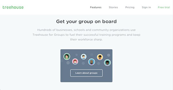
Even though it seems to lean a bit more towards the traditional design, but it successfully establishes the equilibrium between the best of both methods. There is a certain amount of increased detailing of 2.0 with the presence of the modern icon which makes it all the more appealing.
SCEATT:

You may not ordinarily see budgetary locales adopting such a hip style for their website. Over here SCEATT’s calm tone and promoting as a simple-to-use application makes a perfect statement with flat 2.0 adaptation.
Black Tomato:

Another great example of flat 2.0 driven site that consolidates photography and design. The two pictures on Black Tomato’s landing page compliments each other— the intricacy of a stunning, HD photograph and vigorously adapted, cartoonish illustrations emphasize the best purposes of both.
Lander:

The striking graphic elements on the base of Lander’s page shows the cutting edge implementation of flat 2.0. While holding the blocky style, the details are crucial point of interest, as it is obvious by the etchings on the cushion, the glare off the photographs, and the shading on the fragmented paper.
Triplagent:
Again the blend of photography and graphics but with a twist. Triplagent creatively makes a best pne page website with great simplicity. A contrasting tint in the picture utilizes flat 2.0 pretty artistically.
Fitbit:
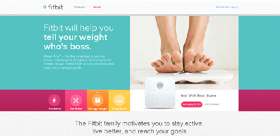
The image and flat design components on the Fitbit website makes gets the best of UI with Flat 2.0. It incorporates a lot of colors that goes well with each other that makes the overall appearance more memorable.
Agency Survival Kit:

While the minimalism and pastel red are typical of original flat, the texture of the book and mild shadows make Agency Survival Kit part of the 2.0 movement.
While the moderation and pastel red are of a usual standard of classic flat design. The surface of the book and smooth shadows make Agency Survival Kit a classic example of the 2.0 development.
Nextr:

Again, this one comes as a blend of both world. The photograph image being blurred is a way to make flat design appear more classy and real. The widget buttons typically reflect the flat 2.0 design with elegance.
Publicis Group:

The 90th commemoration page of Publicis Group gloats 2.0 impact in an evident manner. In the event that you take a gander at the left half of the page, you’ll see the blend of shadows and inclinations descending and emanating outward from the pastel circle and on the blue area underneath it. The site is well structured with the deep rooted aesthetics of Flat 2.0.
The Dropbox Guide:

Looking carefully at the Dropbox’s guide website, you can see 3D texture fabricated such that it few components are raised over others. This is principally apparent in pictures of the kid’s head on the left side and the screwdrivers on the right side. Both pictures have solid, however unobtrusive, dark fringes, which impart profundity and the feeling that they’re perched on top of the groundwork as opposed to mixing in with it.


What a fantastic post! I love to read this topic you made, very ingenious. I would love to read more informational posts about Best mobile app development company in Jaipur.