The art of the movie poster is to summarize the 129,600 stills it takes to make the average feature film – into one single image. We’ve taken a look at ten stand-out examples that use graphics, typography and above all creativity to produce works of art that in some cases outshine the creative movie posters that inspired them.
Black Swan (2010) :
The release of this darkly psychological, ballet-themed thriller starring Natalie Portman, was pre-empted by a set of four teaser creative movie posters from London’s La Boca Design.
As you can see each uses striking and disturbing block design, which calls to mind Russian revolutionary prints. Both the film and the prints call to mind ideas of obsession, bravado and the battle for perfection, in a way that is both unsettling and thoroughly beautiful.
Trainspotting (1996) :
As a hard-hitting, low-budget film about heroin addicts, Trainspotting caused quite a stir when it was released in the 1990s. This helvetica-emblazoned poster, like the film, became a ‘youth culture’ hit almost immediately. This use of orange against black and white photography refers subliminally to warning signs and the information-style typography draws to mind pharmaceutical packaging. The film is built upon multiple narrators, shown in the poster’s larger than life line-up. Apparently the individual portraits were taken literally straight after filming some of the more ‘high-octane’ scenes by Lorenzo Aquis, who also did the photographic work for The Usual Suspects.
ET (1982) :
Spielberg’s sci-fi heart-warmer, ET boasts a poster of iconic and epic proportions. As well as drawing from a pivotal scene in the movie, the finger-to-finger image reminds us of something else on a more semiotic level: Michelangelo’s ‘God Creates Adam’, which can be found in the Sistine Chapel. Here the viewer is already familiar with the work and so is automatically drawn to it. Add to this clever technique the ethereal use of light for the title and reverentially subtle typography and you have yourself a classic.
A Clockwork Orange (1971) :
Bill Gold’s poster draws on all his experience in advertising; as well as being a stunning stand-alone piece it contains the perfect building blocks for a comprehensive marketing campaign. Just like the film, this poster takes a graphic subject and makes it visually stylish. The use of font here is exceptional, cleverly channelling the kind of macabre playfulness you’d find in a demented toy shop. The main graphic features an illustration of A Clockwork Orange’s main protagonist from the opening sequence, both lure you in to a world you’re not entirely sure you’d like to enter.
Star Wars (1977) :
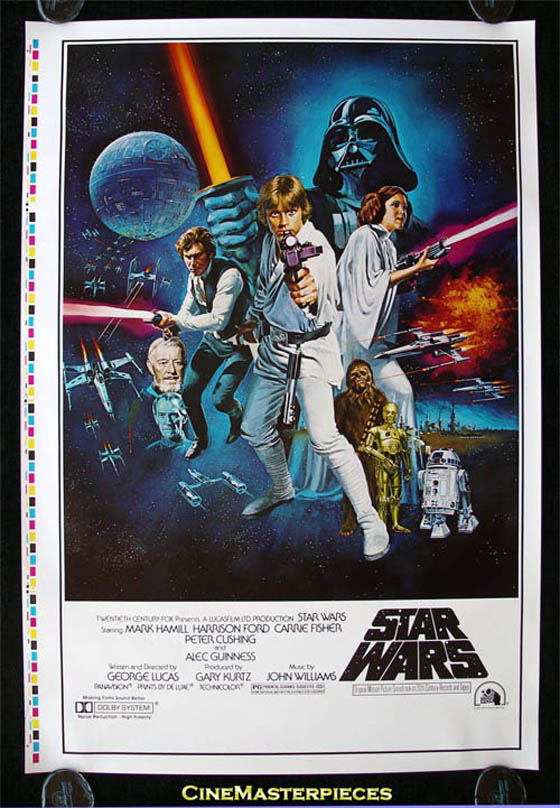
The original Star Wars creative movie posters are a treat for the eyes. The sumptuous use of color and illustration draw you into a dynastic-feeling fantasy world where anything could happen. The sense of adventure is enhanced by the explosions, the dynamic lines of the lightsabres and Luke’s gun, which is leveled right at the viewer. The framing and iconic logo also give the action its own space and enhance the sense of reverence that this legendary film inspires.
Tree of Life (2011) :
Designer Mark Carroll echoes the strange nature and haphazard structure of Tree of Life in this alluring poster. It is made up of multiple stills from the film, some of which virtually camouflage the names of the actors and the film itself. Hands and circles are a recurring theme throughout the mesmerizing grid of stills, which could be scrutinized for hours. Anyone who has seen Tree of Life will know that the film tries to summarize the entire history of the universe – and the poster follows suit. As the designer said himself, he wanted to “create a poster that didn’t tell the audience what to think, but rather, inspired them to think for themselves, and ask their own questions.” Mission accomplished.
Vertigo (1958) :
The careers of designer Saul Bass and auteur Alfred Hitchcock are forever intertwined. As well as story-boarding the famous Psycho shower scene and creating the title sequence of North by Northwest, Bass lent his signature style to this poster for Vertigo. Its vivid colors, sharp angles and spiragraph-stlye detailing mean this poster still adorns many a bedroom wall today. The chaotic font is very much of its time and yet the almost brazenly bold composition ensures the poster has a timeless quality too.
Metropolis (1927) :
Graphic artist Heinz Schulz-Neudamm is the man responsible for this art deco classic. Metropolis is a building block of the classic cinema canon and is regarded as the first full-length science fiction film. Both the film and poster are overlooked by a sinister, futuristic cityscape, dominated by monumental skyscrapers and giant steel structures. Bookending these geometric columns are a dead-eyed robot figure and a jagged font, depicting the film’s title in a way that jars with the otherwise clean lines. Everything about it screams ‘dystopia’ in a way that is subtly terrifying.
Lord of War (2005) :
Anyone familiar with the work of Guissepe Archimboldo and his portraits comprised entirely of fruit and flowers, will see there are comparisons to be drawn here. This poster is at once intriguing and uncomfortable to look at, as the viewer realizes the well-known face of Nicholas Cage has been made up of ammunition. This has the potential to be a transformers-eque macho dream-come-true. However, the design has been created with sympathy for Cage’s arms-dealing anti-hero, and hints at his despair and lack of control. Spreading the billing block out to form a border acts as a clever framing device, which gives the main subject room to breathe.
Man on Wire (2008) :
When it comes to photographic creative movie posters this is an example that really takes your breath away. The eponymous ‘wire’ creates a strong diagonal line that bisects the poster, which otherwise falls away into a dizzying abyss. The documentary tells the story of real-life obsession and this still, taken from the film, helps to explain why it won an Oscar in 2009. The title is pure minimalism, standing out in white capitals and complemented by the unequivocal praise of The Times review; “Truly Extraordinary”. This poster somehow manages to capture the raw passion of a man, Philippe Petit, who took his life in his own hands in 1974, for no monetary gain whatsoever.


